US Department of Defense [DoD] systems design teams are moving to “Set Based Design” which requires assembly of diverse inputs, models, historical data and simulation into a single very large tradespace of possible design options. The key idea is to defer narrowing the set of choices until the entire space of possibilities is more fully understood. DoD systems design teams that have worked with small numbers of models and assembled small tradespaces (thousands of options) need new tools and approaches to generate, analyze and understand the implications of very large tradespaces (billions of options). For small tradespaces, trades among system properties have been categorized with combinations of manual inspection and small‐scale analyses tools. For Analysis of Alternatives (AoA) of a very large tradespace generated through set-based design, new “Big Data” methods of tradespace characterization need to be developed.
DoD Engineered Resilient Systems (ERS) need to have the ability to adjust their functioning after disturbances, recover from failures, and sustain required operations. There are large amounts of data, also known as “big data” and “big datasets,” in an ERS tradespace environment. Big data is often dynamic, heterogeneous, inter‐related, noisy, and untrustworthy. It is usually represented in high‐dimensional forms and is not well structured/organized because the data is generated from disparate sources. It can be structured (e.g. relational databases), unstructured (e.g. text, image), and semi structured (e.g. radio frequency identification data).
Data quality is an important issue. Error data, inconsistent data, and missing/incomplete data can lead to wrong analysis results and wrong decision‐making. A significant amount of research about data quality has been done in the Environmental Research Lab at ERDC. Error data detection can be done by using clustering or association rules. Artificial intelligence (AI) can be used to identify and clean dirty data. Unstructured data should be converted into analysis‐ready datasets.
To understand and characterize the underlying patterns of the tradespace big data, a number of critical technical challenges must be addressed: (1) data cleansing (eliminating noisy, erroneous and inconsistent data), (2) data integration (resolving heterogeneities in data structure), (3) dimension reduction and feature extraction of unstructured data, and (4) visualization of high dimensional data to help get a complete view of data and discover data values. The ISER is lead the efforts to develop solutions that meet the needs of these technical challenges.
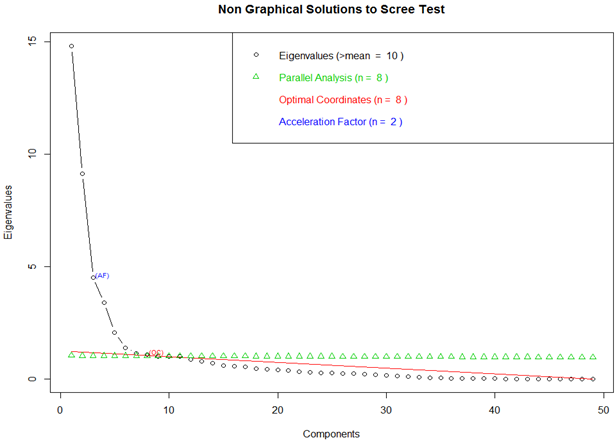
Principal Component Analysis
Pareto Frontier
A surrogate model (metamodel) serves as a low-cost substitute for a high-fidelity and computationally expensive model/simulation for evaluating a response. A surrogate model depends on m predictor variables defining the design space as well as design and analysis of (physical or computer) experiments used to identify the sampling points {x} and associated values for response(s) of interest f1 (x), f2 (x),etc
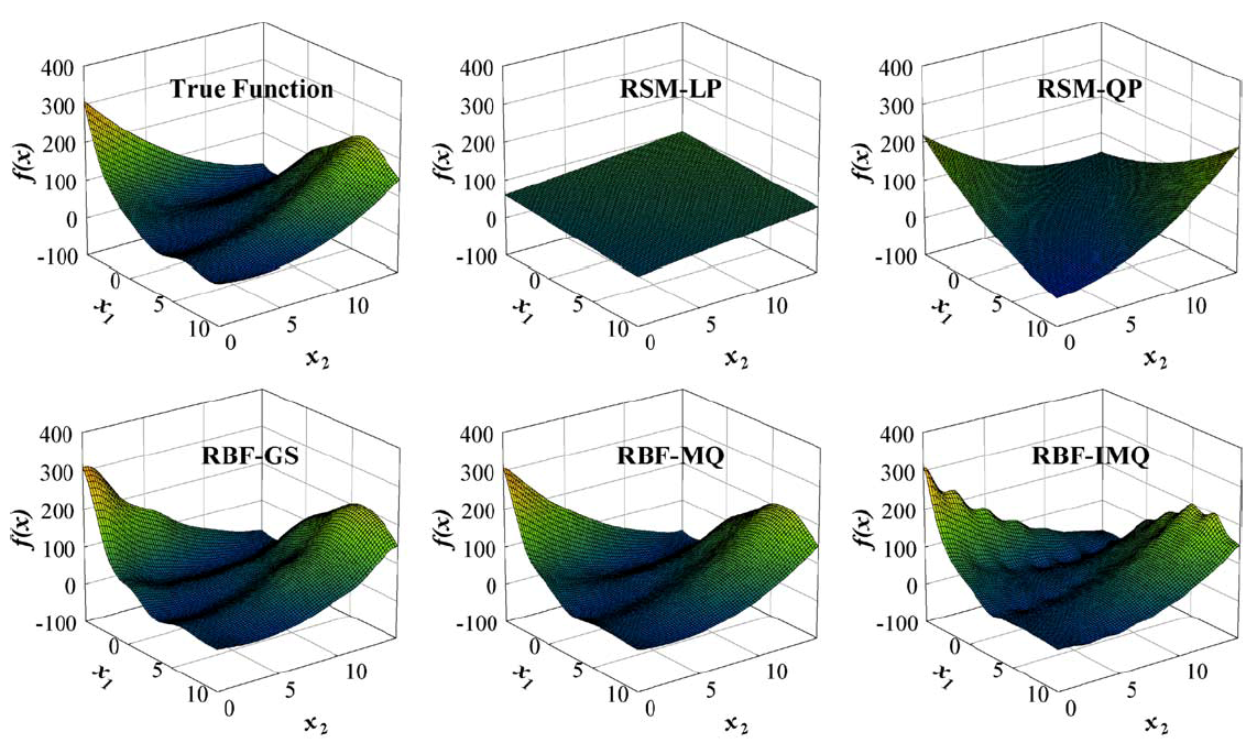
Surrogate Modeling is a group techniques used to approximate more “expensive” models. High-fidelity simulations require many computational resources and time to generate responses. Many times these simulations can only be run on a High-Performance Computing (HPC) platform. A surrogate model uses the same input of a simulation and mimics the simulation’s output while being significantly “cheaper” than the simulation.
Many techniques exist for creating surrogate models: Polynomial Response Surfaces (PRS), Radial Basis Functions (RBF), Kriging, and many others. The ISER is working to create a suite of surrogate modeling tools coded in R.
Below is an example of an RBF using the Inverse Multiquadric kernel modeling a function known as the Peaks Function. The changes in the model are a result of adjusting a constant within the kernel varying from 0 to 1.
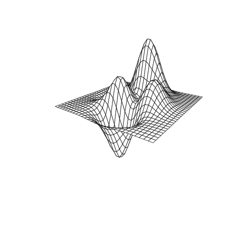
Figure A: true response
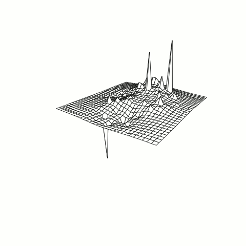
Figure B: RBF model of response with tuning parameter adjustment
The immersive data visualization module use VR headsets (Oculus/HTC) and a non-haptic controller (Leap Motion) to allow stakeholders the ability to visualize the tradespace options and data plots in an immersive 3D environment. The system allows the users to manipulate the data in the 3D space and create new subset of data directly from the visualization environment.
In the long term, the objective is to be able to conduct decision-based tradespace analytics such as Pareto Frontier and other tradespace reduction techniques completely in the virtual space. Afterwards, the resultant transformed datasets can be exported back into traditional analytic toolsets for further exploration. User interface design for immersive virtual systems is a priority for this research effort. Currently, there are no natural affordances or military standards for 3D interface development in virtual environments. The study of different interface design approaches will be conducted to ensure that the visualization system is adequate in regards to usability for the end user.
Visualizing Big Data is not a trivial task. For example, a network flow dataset obtained from the Visual Analytics Science and Technology (VAST) Challenge 2013: Mini Challenge 3 captures traffic moving across a fictitious computer network. The dataset is composed of 19 variables and 23,258,685 observations. Variables include information like the IP addresses of computers that are connecting and being connected to. Each observation in this dataset represents a series of messages between two computers that have been combined to form a single flow record.
How can we create a visualization that communicates meaningful information about the data?
We can visually analyze this network as a graph . If we treat each unique IP address as a node we find that there are only 1,402 nodes in the network. Furthermore, we can treat each unique observation as an edge in our graph and sum up repeated edges to give weight to the unique edges which reduces the total number of observations (edges) to only 24,992.
Using the R language we can perform this data filtering. Afterwards, we can use the graphing program Gephi to produce the following visualization.

In this graph, Gephi uses a force-directed/simulated annealing algorithm to cluster nodes that are closely related. Nodes are determined to be closely related by their number of edges and edge weight.
The colors of the nodes represent different systems.
The color of the edges represent different connection types.
The size of the node is determined by its degree, that is, the number of edges going into and out of the node.
